7 Signs Your Childcare Website Is Overdue for an Upgrade
Most centres don’t wake up one day and decide their website needs work. It happens gradually — a broken link here, an outdated photo there — until one day a parent mentions they had trouble finding your fees online, and you realise it’s been years since anyone gave the site a proper look.
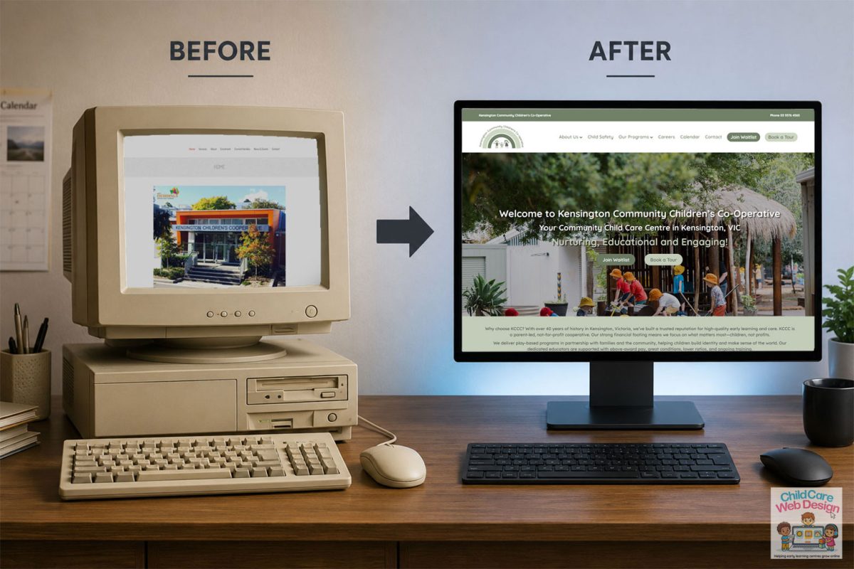
A recent example is Kensington Community Children’s Co-Operative, a not-for-profit centre based in Melbourne, Victoria, As you can see from the feature image above, their previous website was outdated and made it hard for families to find what they needed. The new site www.kccc.org.au fixes this with clear program pages for each age group, prominent Join Waitlist and Book a Tour buttons, and the phone number always in view. This gives families a simpler path from first visit to enquiry, and a website that reflects the quality of care the centre delivers.
If any of the following sound familiar, it might be time.
1. Your original web designer has “gone walkabout”
This one comes up more than you’d expect. A centre had a website built years ago by a local designer, a friend of a friend, or an agency that’s since closed down or stopped returning calls. Now nobody can log in, nobody knows the hosting details, and the site just sits there, unable to be touched. If you can’t remember the last time someone updated your site — or worse, you genuinely don’t know how to — that’s reason enough on its own.
2. It doesn’t work properly on a phone
Pull up your own website on your phone right now and have a proper look. Do you have to pinch and zoom to read anything? Do the menus overlap or disappear? Does a button take three attempts to tap accurately? Most parents are browsing childcare websites on their phone, often one-handed while managing a toddler, so if your site isn’t genuinely comfortable to use on mobile — not just “technically loads” — you’re losing people before they’ve even read a word.
3. The photos are older than your youngest room leader
Stock photos of children who’ve never set foot in your centre, or real photos from an era when your outdoor area looked completely different, quietly chip away at trust. Parents notice. A childcare website should feel like a true reflection of what a family will actually see when they walk in the door — current educators, current spaces, current kids (with proper consent, of course).
4. You can’t update it yourself
If changing your fees, adding a new staff photo, or posting a note about a public holiday closure requires an email to a developer and a two-week wait, that’s not a sustainable setup. A well-built modern childcare website should let you or your admin team make simple updates in minutes, without needing any coding knowledge or a standing invoice from a web agency for every small change.
5. It loads slowly
Slow websites don’t just frustrate visitors — they get penalised by Google, which means fewer local families finding you in search results in the first place. If your site takes more than a few seconds to load, particularly on mobile data rather than fast wifi, you’re likely losing both search ranking and impatient parents in equal measure.
6. There’s no clear way to enquire or book a tour
Have a proper look through your own site as if you were a parent. Is it obvious what to do next on every page? Is there a simple, low-effort way to book a tour or ask about vacancies, or does someone have to hunt down a phone number buried in the footer? If the path from “interested” to “enquiry” isn’t dead obvious, you’re losing people who simply give up and try the next centre.
7. It doesn’t reflect who you are now
Centres evolve — new programs, a refreshed philosophy, new leadership, maybe even a full rebrand. If your website still talks about a program you retired two years ago, or doesn’t mention the bush kinder program you’re now proud of, it’s not doing its job. Your website should be a current, accurate reflection of your centre today, not a time capsule of where things stood when it was first built.
What an upgrade doesn’t have to mean
A lot of centre directors hear “website upgrade” and immediately think it means a huge cost and months of disruption. It doesn’t have to. Sometimes the fix is targeted — a mobile-friendly redesign, fresh photography, a simpler enquiry form, or moving to a platform your team can actually manage. The team at Childcare Web Design can look at what you’ve got and tell you honestly whether it needs a full rebuild or just some strategic patching up.
Worth a second look
If you’ve read through this list and found yourself nodding along more than once, it’s probably worth getting a second opinion. A quick, honest audit of your current site — what’s working, what’s not, and what it would take to fix — costs you nothing but a bit of time, and it might save you from losing enquiries to a competitor whose site simply does a better job of putting its best foot forward.