From Click to Enrolment: How Your Website Design Affects Your Waitlist
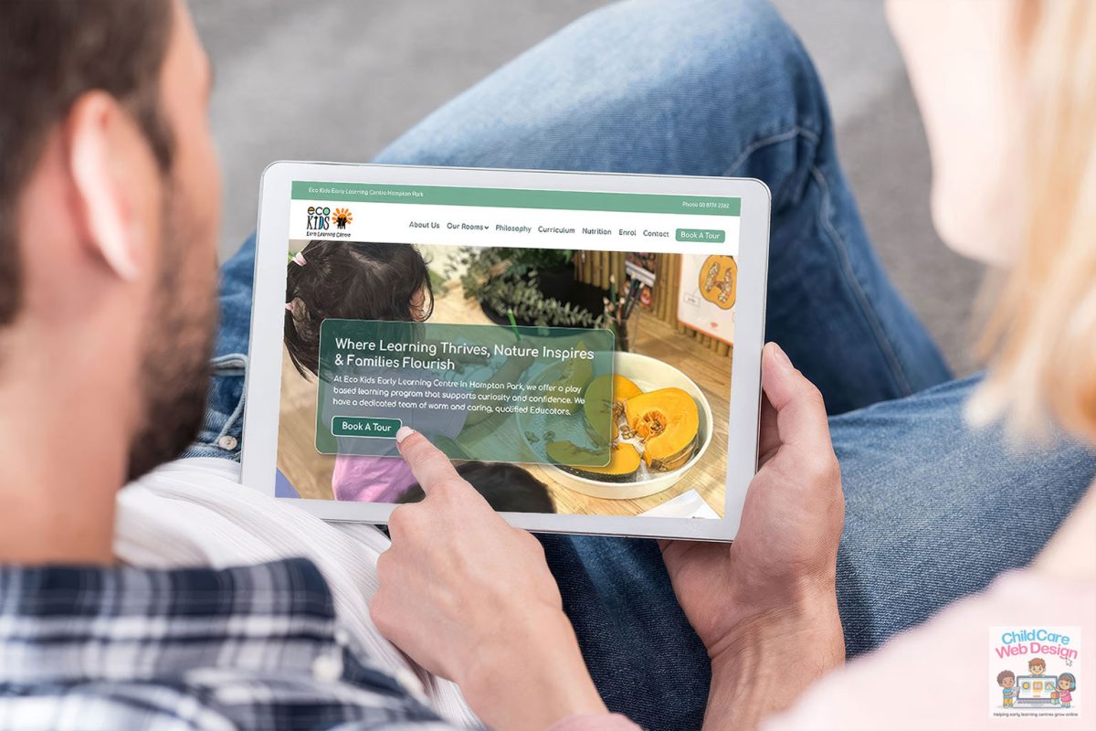
There’s a big difference between a website that looks nice and a website that actually turns visitors into enrolment enquiries. Plenty of childcare centres or family day-cares have the first without the second — a lovely home page, a nice logo, some warm colours — but nothing guiding the parent toward actually picking up the phone or filling out a form.
If you’ve ever wondered why your website gets decent traffic but not many enquiries, the design itself is usually the answer.
Parents decide fast — your site needs to keep up
Most parents spend somewhere under a minute deciding whether a childcare website is worth their time. That’s not much room to make a case. If they land on your homepage and have to hunt around for basic information — where you are, what ages you take, whether there’s a vacancy — a fair chunk of them will simply leave and try the next centre in their search results.
The fix isn’t complicated: put the essentials front and centre, above the fold, before anyone has to scroll. Your suburb, your age groups, your current vacancy status if you can manage it, and one obvious button telling them what to do next.
Every page needs a clear next step
This is probably the single biggest gap we see on childcare websites. There’s beautiful information about the philosophy, the educators, the daily routine — and then the page just… ends. No button, no prompt, nothing telling the parent what to do with all that lovely information they just read.
Every page on your site should have an obvious, low-effort next step. That might be:
“Book a Tour” — ideally linking straight to a simple form or calendar booking tool
“Check Vacancies” — even a short form asking for age group and preferred days
“Enquire Now” — a simple form, not a demand to call during business hours
“Download Our Enrolment Pack” — great for parents doing early research
The goal is to make the next step so easy that even a tired, distracted parent scrolling on their phone at 9pm can complete it in under a minute.
Forms are where good intentions go to die
If your enquiry form asks for twelve fields including emergency contacts and immunisation history before a parent has even booked a tour, you’re going to lose people. Save the detailed paperwork for after they’ve committed to visiting. At the enquiry stage, ask for the bare minimum: name, phone or email, child’s age, and maybe preferred days. You can gather everything else once they’re through the door.
Mobile matters more than desktop, full stop
The majority of parents researching childcare are doing it on their phone — often in short bursts between other tasks. If your site isn’t genuinely easy to use on a small screen (not just “technically works” but actually pleasant — big enough buttons, readable text, forms that don’t make you pinch and zoom), you’re losing enquiries you’ll never even know about, because that parent never told you they left.
Trust signals near the point of decision
Right where you’re asking a parent to take action — book a tour, make an enquiry — is exactly where you want your strongest trust signals sitting. A testimonial from a happy family, your quality rating, a photo of your outdoor space, a note about your educator-to-child ratios. Parents are at their most hesitant right before committing to an enquiry, so that’s the moment to reassure them, not three pages back.
Keep the fees conversation honest
We get it — fees can feel like a sensitive topic, and some centres worry that publishing them scares families off before they’ve had a chance to explain the value. But in our experience, vague or hidden fee information does more harm than good. Parents comparing several centres will often skip straight past the ones that make them ring up just to find out the price. Even a simple “fees from $X per day, contact us for a full breakdown” gives people enough to keep going, rather than bouncing straight back to Google.
Track what’s actually happening
You don’t need to become a data analyst, but it’s worth knowing roughly how many people visit your site each month and how many of those turn into actual enquiries. If your traffic is healthy but enquiries are low, that’s a strong sign the issue is with your site’s design and messaging, not your marketing reach. A good web designer should be able to set this up simply and explain it to you in plain English, not jargon.
It comes down to removing friction
At the end of the day, boosting enrolments through your website isn’t about tricks or gimmicks. It’s about removing every unnecessary bit of friction between a parent landing on your site and them taking that first small step — a tour booking, an enquiry, a phone call. Make it obvious, make it fast, and make it work properly on a phone, and the enquiries tend to follow.